 Just last week some information came across our radar and we thought…

“we have to share this with our Eat REAL America community!”
It triggered all kinds of interesting discussions among our family and friends, and we would love to know your thoughts and reaction!
Here is the first graph that caught our attention… 
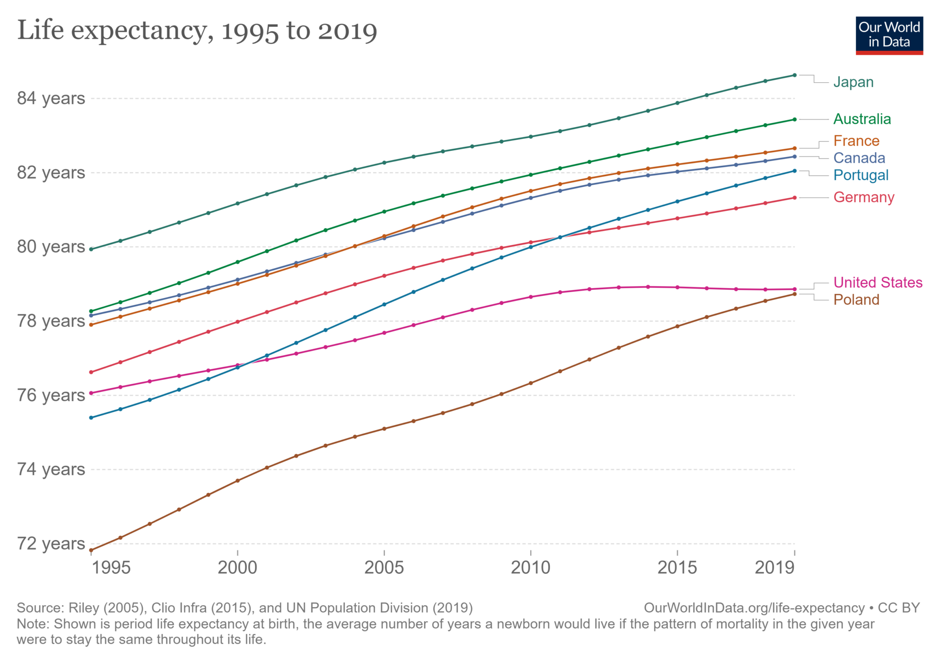
Why has the U.S. life expectancy flatlined, and even declined?
And, why isn’t the same trend being seen in other countries? How have countries like Portugal and Poland, who had shorter life expectancies than the U.S. just a few years ago, caught up and even now surpassed the United States?
Is the lesson here that we should pack up and move to Japan? The good news is you don’t need to move to another country for a long and healthy life, although you may recall from our coaching tip “Breaking 100!” that Okinawa, Japan is one of the Blue Zones, or regions where they found the highest percentage of people who live to 100 (and where there is a much lower percentage of people with chronic disease – remember, it’s not just dying you should worry about).
Could this be because other countries are spending more on healthcare than the U.S.? Interesting…
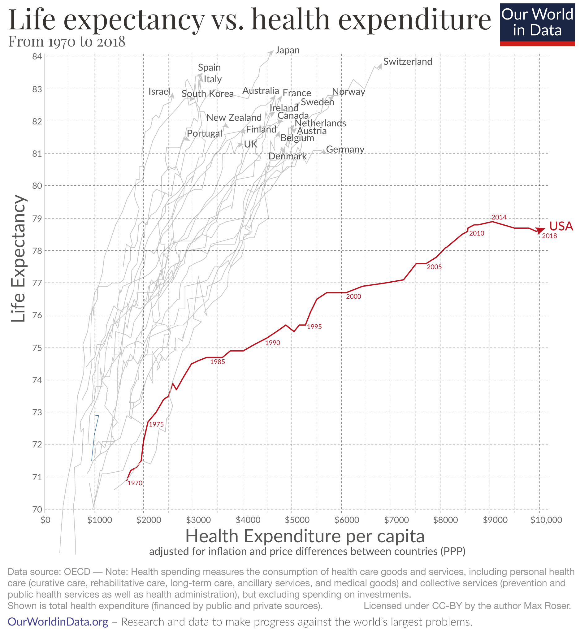
This graph shows that the U.S. has the highest healthcare spending of any other country in the world, yet our average life expectancy is shorter than so many other countries.
And, while there is a consistent trend of increasing spending on healthcare, other countries are seeing their lifespans go up (the return on their investment), while the U.S. lifespan has gone sideways – and even decreased – for several years.
There are endless opinions about the U.S. healthcare system and why the results are what they are. We saw comments attributing this to a focus on treating illness and disease vs. keeping people healthy, lifestyle choices and the prevalence of highly-processed foods, and even a view that healthcare providers are not equipped to address food and nutrition as part of their patient treatment plans.
In discussions about this graph, many latched on to the very insightful quote attributed to Wendell Berry, “People are fed by the food industry, which pays no attention to health, and are treated by the health industry, which pays no attention to food.“
And, one interesting comment was, “Diet, exercise and community have a lot to do with it. Genes load the gun, but lifestyle pulls the trigger.“
The lifestyle comments definitely seem relevant. Here is a summary of the causes of death in 2019..
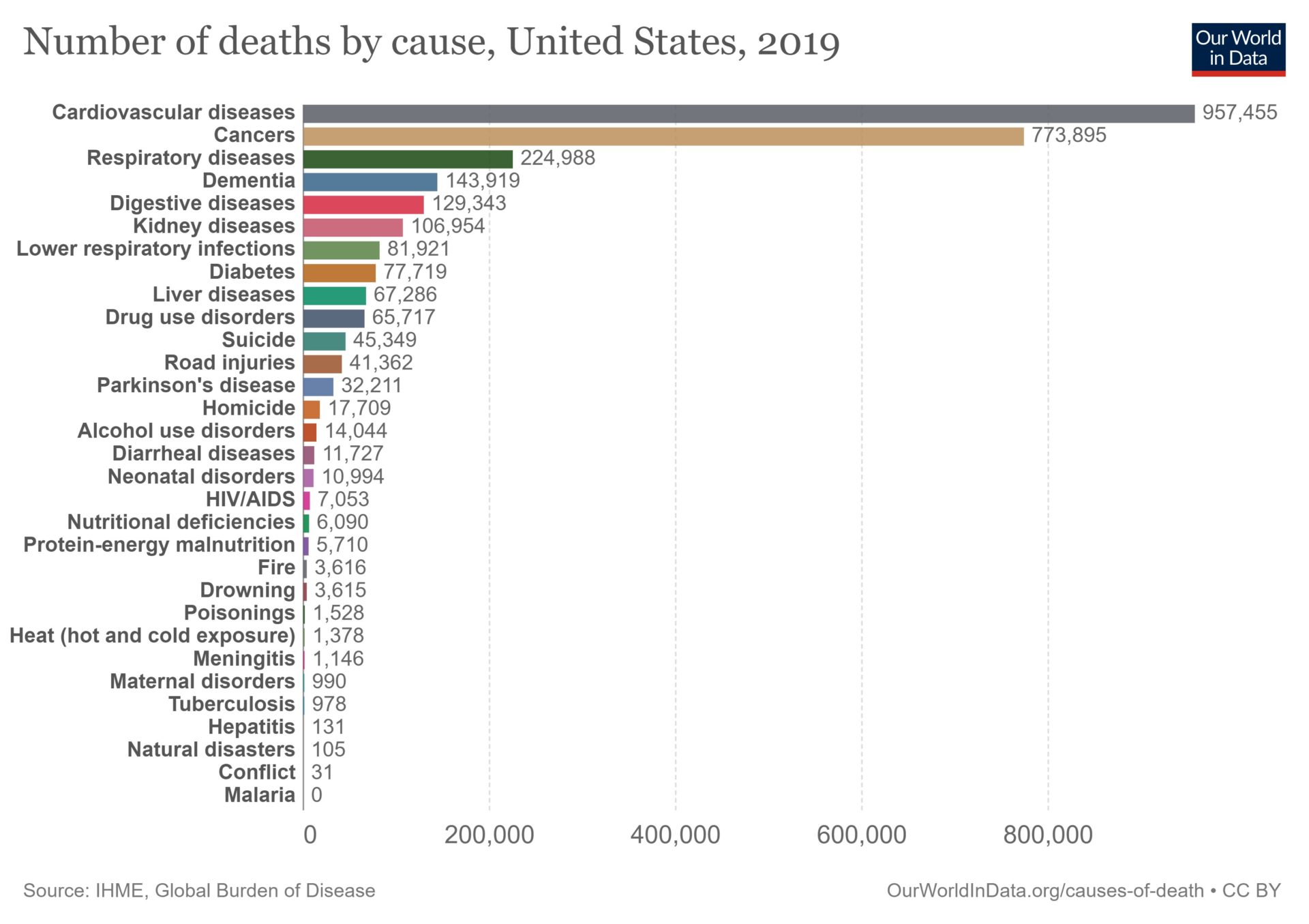
You may remember our coaching tip, “The Other Pandemic?” where we mentioned that poor diets are responsible for over 500,000 deaths every year. In that coaching tip, we wondered out loud what we could achieve if we used the same energy and resources dealing with the Covid pandemic to tackle the “poor diet pandemic” that is causing hundreds of thousands of deaths EVERY YEAR.
There is one more graph we wanted to share…this shows actual causes of death vs. Google searches and media coverage:
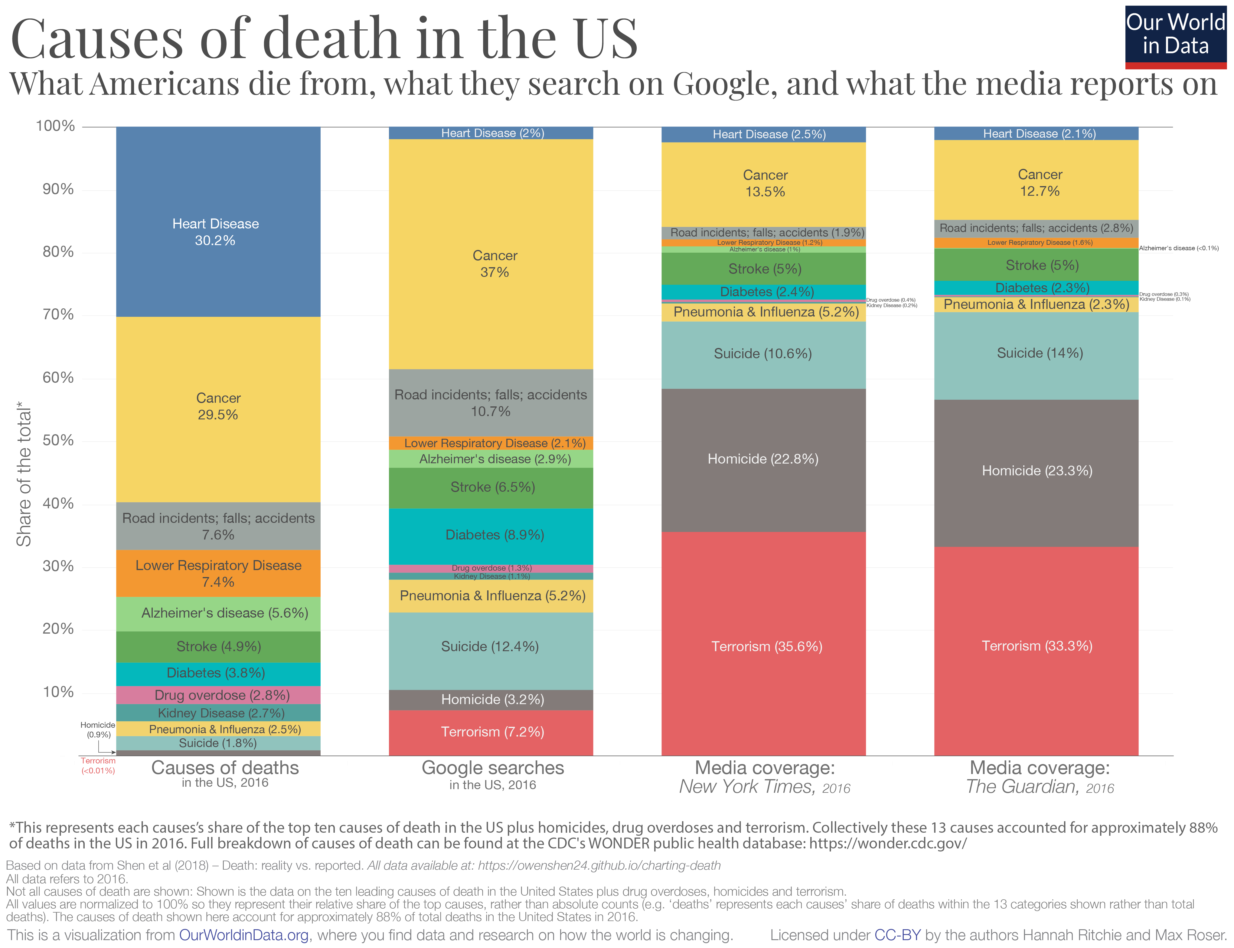
As you can see, there is a huge disconnect between what we see in the news and reality.
Almost one-third of deaths in the U.S. resulted from heart disease, but this accounted for only 2% to 3% of Google searches and media coverage. Interestingly, in general, Google searches are much more closely related to actual causes of death vs. the media. Terrorism, homicide and suicide get A LOT of attention in the media (> 67%), yet are responsible for less than 3% of fatalities.
We will let your imagination guide you about some of the comments we saw relating to this information!
Hint: it has a lot to do with incentives for the media to make money vs. objectively reporting the facts and helping us to achieve our ultimate goal of living a long, healthy and happy life.
So, where is the Good News?
 And, yes, there is good news!
Remember, these life expectancy numbers are averages, and with the right lifestyle choices, you can improve your odds of dramatically beating these averages to live a LONG, HEALTHY and FULFILLING life! Without moving to Japan! For a fun and entertaining way to estimate your life expectancy (including how many healthy years you may have left), check out our coaching tip “Do You Know How Many Years You Have Left?“.
We have so many coaching tips to help keep you inspired and on track…here are just a few that might be helpful:
21 Ideas to Improve Your Eating Habits
A Little Burst of Inspiration!
Strategies to Overcome the Foods in our Everyday Environment
Bring Convenience to Your Kitchen
What is your reaction to this information?
Do you have a theory on why the U.S. is falling behind so many other countries in terms of our years of life, and especially healthy years of life?
Please share!
I’m a retired Massage Therapist and one of the things we were taught and is so true – western medicine is all about treating the symptoms and not the root of the problem. So it makes sense focus is on junk food than healthy foods – it keeps big PHARMA and the doctors in business. This is also why many are still against alternative medicine. It will put them out of business. I go back to the prairie days – they had one doctor for each town if that. There was a community, and everyone helped each other. The barter system trading and they used natural medicine using herbs, flowers, roots and so on. Just think how healthy America can be if we changed the focus on fresh foods, our soils, less pesticides and more..
So true, and excellent thoughts, thank you for sharing!
A trip to the grocery store quickly reveals all the reasons why so many of us have health issues. We are bombarded with appealing but unhealthy choices. Aisle after aisle filled with nothing but soda pop, pizza, chips, candy, cookies, breads, bakery goods, processed lunch meats, bacon and sausages, ice-cream treats, frozen prepared dinners, etc. With either totally empty calories or so high in added sugar, fat, sodium, and preservatives.
Our great-grandmothers would shop almost daily for fresh vegetables and fruits, locally grown, fresh cuts of meat from the butcher, fresh-baked wholegrain breads from the baker. Homemade dinners were the norm. With the shift to working outside the home and busy schedules, convenience became more important. Who has the time (or energy) to cook? And as one of my daughters reminds me: ‘Mom, not everyone likes to cook!’
But as Krista and Zonya tell us: Have a plan for when you don’t have time! It takes the onus out of family meal preparation. Healthy slow-cooker meals, stir-frys, quick and easy 30 minute dishes are all great places to start. Get everyone in the family planning, cooking and helping out so the job doesn’t always fall on one person’s shoulders. Visit the farmers’ market together on Saturdays for the freshest produce and fall in love with the beauty, bright colors and smells of fresh foods. Be adventurous! What new thing can we try this week? My husband, as old as he is, finally ate fresh chopped fennel on a pizza we made and found he actually liked it! So wonders never cease. 🙂
You summed it up well! Preparing and cooking at home does require time and energy, but it is so worth it! Your health will thank you, and you are right, wonders never cease! 🙂
Hmmm 1. I just watched the documentary Not So Pretty after doing some research on toxins in skincare and here in the USA the FDA is ver lenient when it comes to parameters for makeup and skincare companies. However in European nations and especially England they have strict standards for excluding highly toxic ingredients like asbestos and BHA, BHT, BPA, phthalates that are hormone disrupters. There are all kinds of side effects from these toxic materials on our skin, holding our products we it on our skin… including cancer, infertility, significant abdominal pain, and asthma. Also minority populations are targeted with advertising for some of these big toxic laden skincare companies and they have a great impact on their health.
Hmmm #2 I’m curious about the percentage of Americans who have access to naturopathic healthcare (or functional medicine) or who can even afford it? We need to be educated about addressing the root causes… how to solve them and not just cover them up.
This does demonstrate it very well that mostly we are fearing the wrong things. Many of us are not focused on the greatest threat to our life. The Number of Deaths by Cause graph is very shocking. But, at the same time, I have to ask myself what SHOULD it look like? What would be better? So I think we should pick an age, maybe 80 or 90, and do the graph for people below that age only. And then add another bar for people to who died in this year over the cut off age and just mark that, “Winners!” 🙂